")
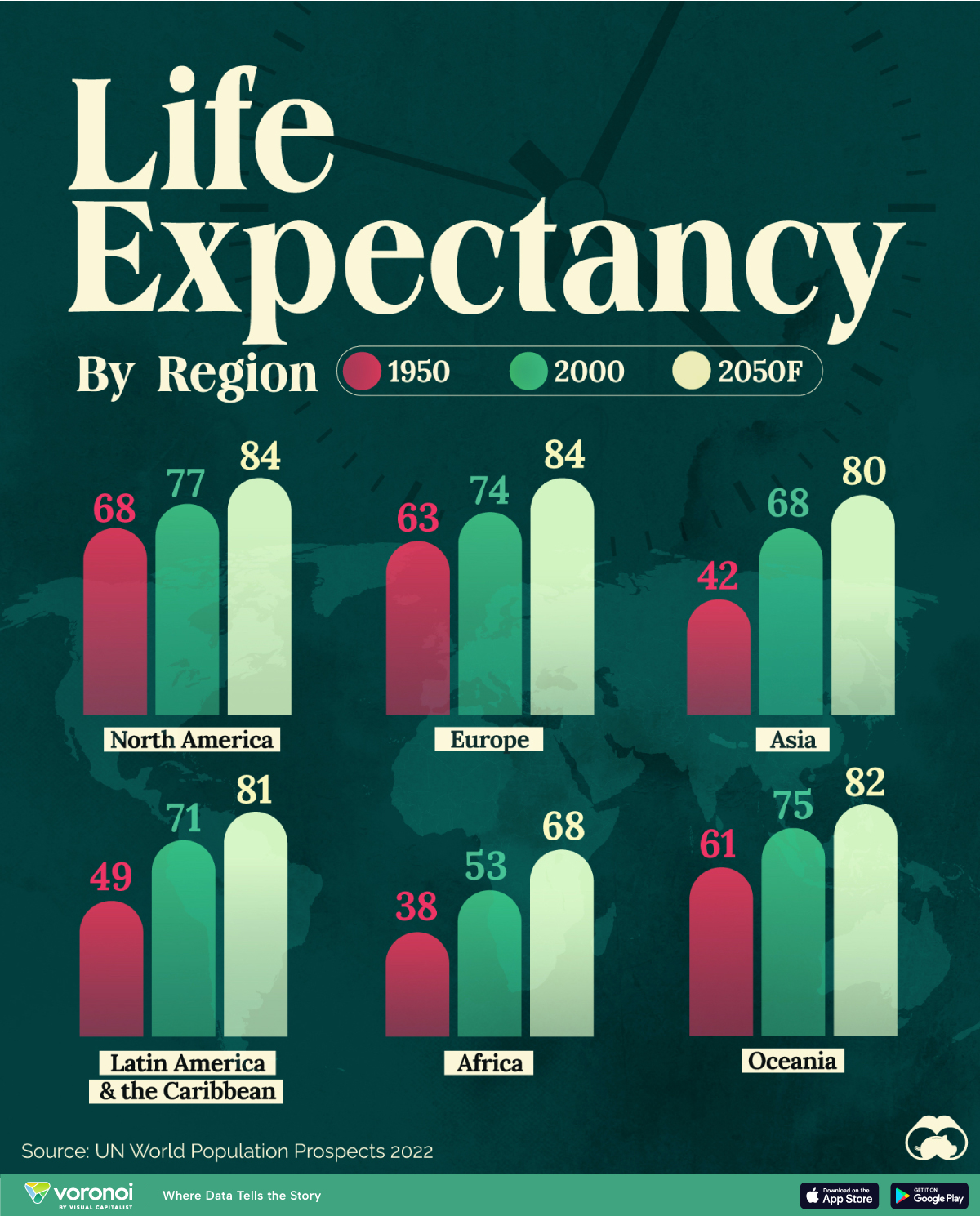
Average life expectancy at birth is projected to surpass 80 years in most global regions by 2050, according to the UN World Population Prospects 2022.
This article was written by Marcus Lu and originally published by Visual Capitalist.
This infographic illustrates the trajectory of life expectancy at birth for both sexes, comparing data from 1950 and 2000 with the organization’s projections for the year 2050.
Life Expectancy to See Substantial Growth
At the beginning of the 19th century, no country had a life expectancy exceeding 40 years, with much of the global population enduring extreme poverty, limited access to medical care, and a lack of sanitation.
By 1950, newborns in Europe, North America, Oceania, Japan, and parts of South America were seeing life expectancies surpassing 60 years, while in other regions, newborns could only anticipate a lifespan of around 30 years.
For instance, individuals in Norway had a life expectancy of 72 years, while in Mali, it was merely 26 years. On average, Africa had a life expectancy of only 38 years.
Since then, life expectancies have substantially grown worldwide. Notably, between 1950 and 2000, significant progress was observed in Asia and Latin America and the Caribbean.
| Region | 1950 | 2000 | 2050F |
|---|---|---|---|
| North America | 68 | 77 | 84 |
| Latin America & the Caribbean | 49 | 71 | 81 |
| Europe | 63 | 74 | 84 |
| Asia | 42 | 68 | 80 |
| Africa | 38 | 53 | 68 |
| Australia & Oceania | 61 | 75 | 82 |
The improvement in life expectancy can be attributed to various factors such as advancements in medical technology, better healthcare infrastructure, improved sanitation, access to clean water, and increased awareness about health and nutrition.
In Perspective With History
Although today it seems like rising life expectancy is a given, for much of history it’s worth noting that the situation was much more static.
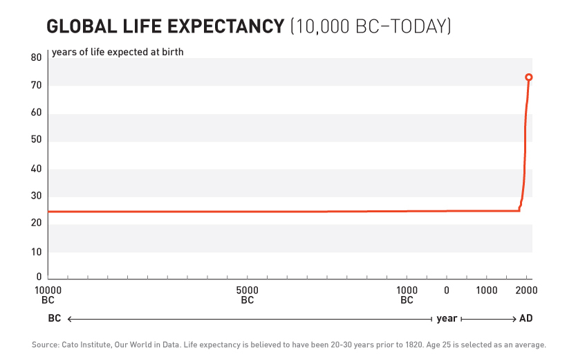 As shown in the above chart, for most of human history life expectancy at birth actually sat in the 20-30 year range. It’s only since the mid-19th century that the aforementioned improvements (sanitation, clean water, etc.) allowed for the exponential and regular progress we see today.