Image Courtesy Of Michal Matlon On Unsplash
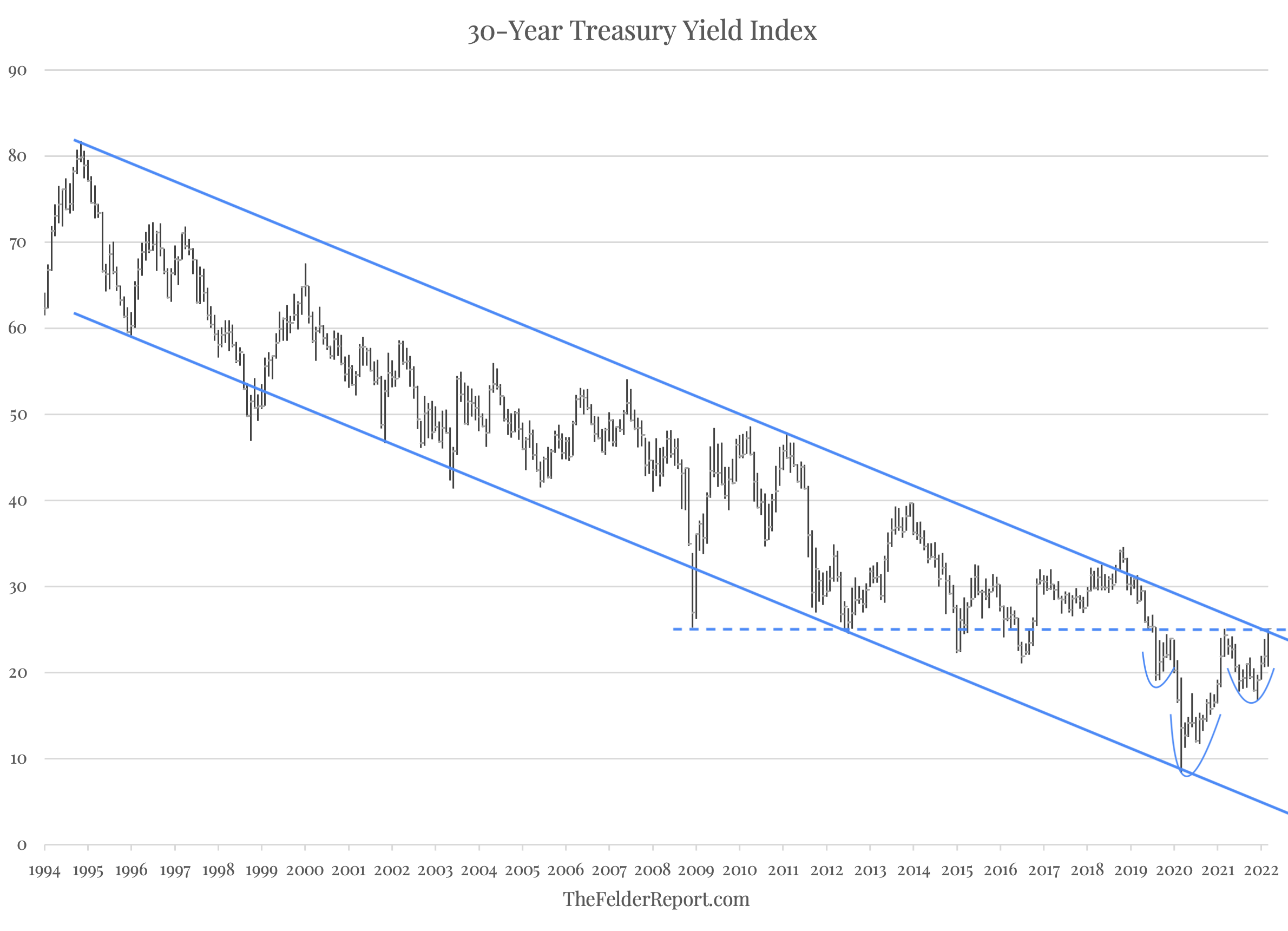
The long-term chart of the 30-year treasury yield may now be the most important chart in the world. For the past 30 years or so, the yield on the long bond has formed a fairly neat channel that has only been violated relatively briefly at times. The drop below 1%, at the height of the Covid panic, tested the lower end of that channel. Since then, it has reversed higher and now appears poised to test the upper end. This area also coincides with key horizontal resistance at 2.5% that dates back to the lows put in at the height of the Great Financial Crisis.
This article was originally published by The Felder Report.
In reversing from its low two years ago, the 30-year yield has also formed a pretty clear inverted head and shoulders pattern so it appears we are at a crucial spot for the multi-decade bond bull market. A reversal lower here for the long bond yield would suggest that the bull market remains intact; a breakout higher, however, would suggest it has finally come to an end. It would also indicate that, after a very long hiatus, the bond vigilantes may have returned and are determined to pressure a Federal Reserve that has fallen further behind the curve than ever before.
The U.S. economy grew 2.1% in real terms in 2025, but that national figure tells… Read More
Much of the concern surrounding artificial intelligence is about power: the technology’s economic power to… Read More
Cuba fully restored its energy grid early Wednesday after the third nationwide blackout this year, but… Read More
Up until now, the politicization of AI models generally ran in one direction with US… Read More
Americans are increasingly reaching major life milestones later than previous generations, and parenthood is no… Read More
Sen. Scott Wiener requested the exemptions, and they exactly match his SB 145 legislation. Editors… Read More
This website uses cookies.