Image Courtesy Of Schiff Gold
The seasonally adjusted money supply in January increased by $31 billion. This was the first increase in the money supply in five months.
This article was originally published by Schiff Gold.
Figure: 1 MoM M2 Change (Seasonally Adjusted)
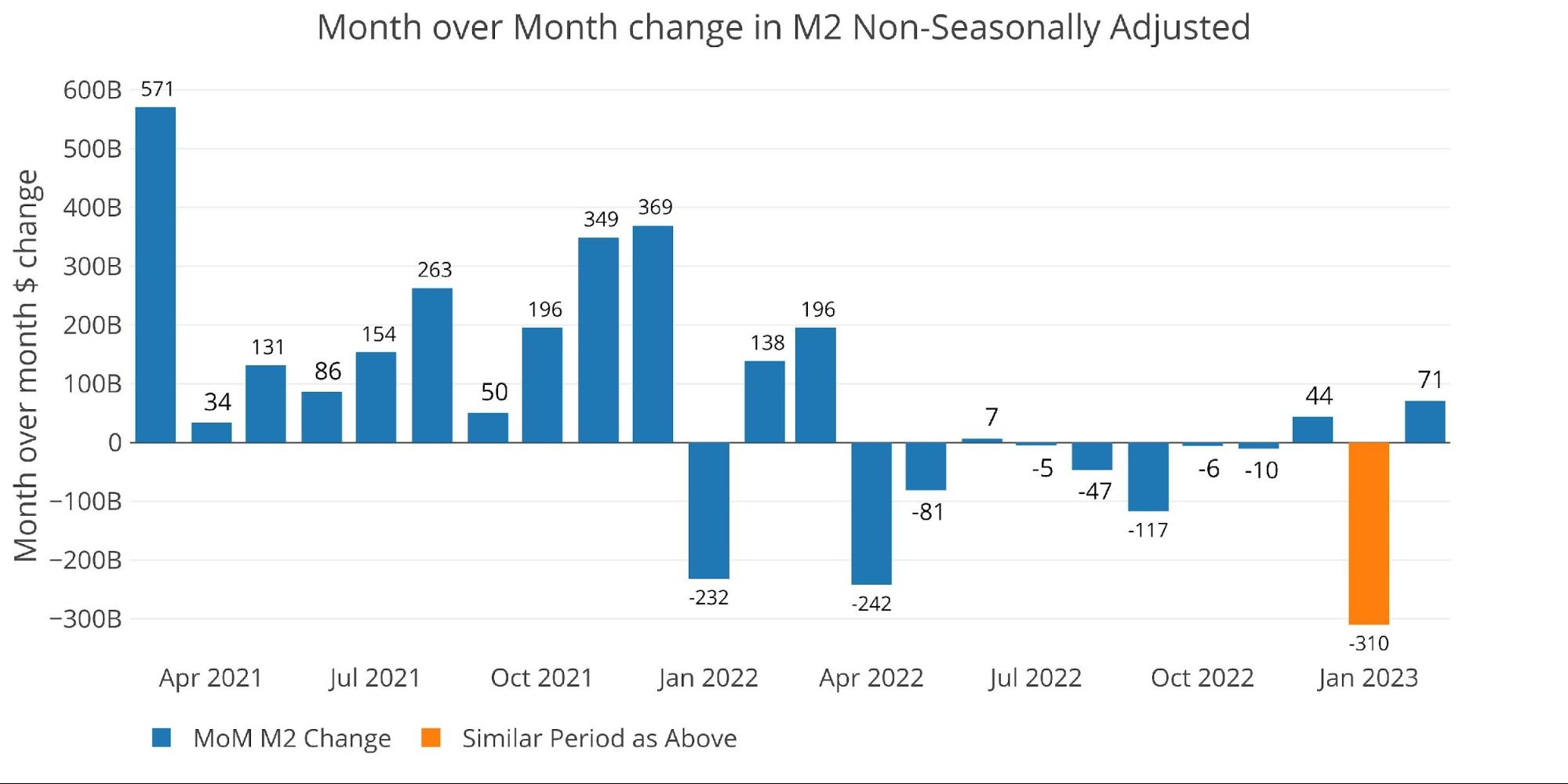
To show how much the Fed seasonal adjustments can impact the numbers, below are the raw numbers. The raw numbers are ahead of the adjusted numbers by a month so January is colored in orange below. It shows an incredible $310B drop in money supply. This means the Fed seasonal adjustments modified the actual print by $341B!
Figure: 2 MoM M2 Change (Non-Seasonally Adjusted)
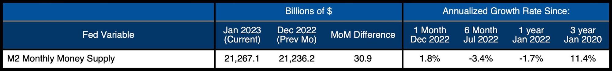
Looking at the seasonally adjusted numbers shows that this month increased the money supply by 1.8% which was above the -1.7% 12-month trend and well above the -3.4% 6-month trend.
Figure: 3 M2 Growth Rates
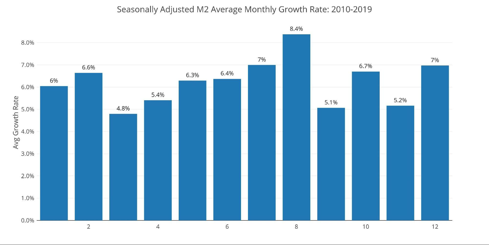
The average for January is 6%, which means this month is still coming in well below the historic average for January, despite the relative increase (seasonally adjusted).
Figure: 4 Average Monthly Growth Rates
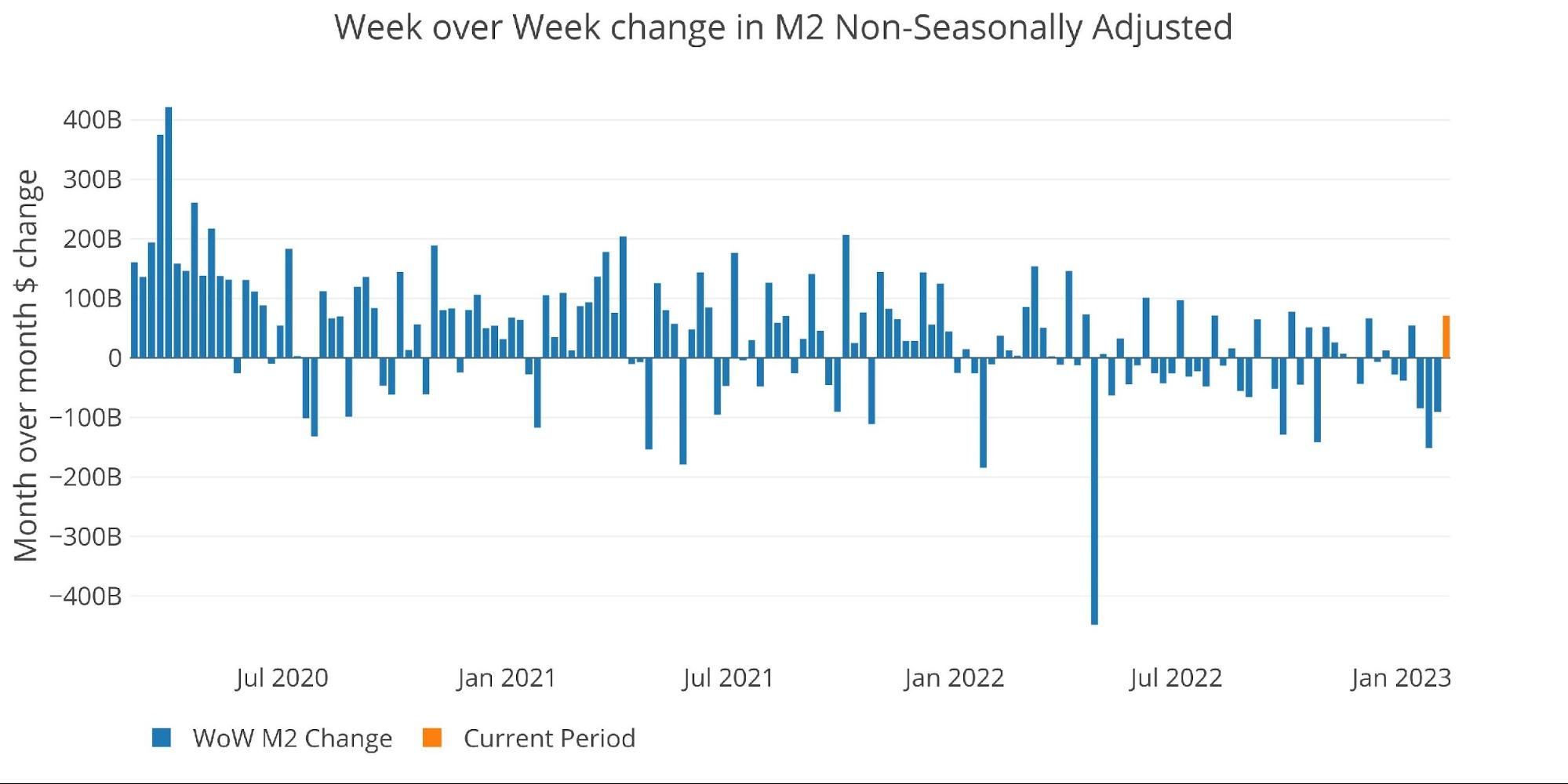
The Fed only offers weekly data that is not seasonally adjusted. As the chart below shows, the 3 weeks before the most recent week saw a steady drop in the money supply. Only the recent week saw an increase, coming in at $71B vs the prior three weeks of -$84B, -$151B, and -$91B.
Figure: 5 WoW M2 Change
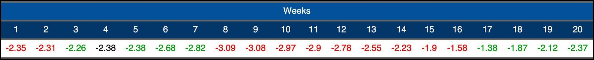
The “Wenzel” 13-week Money Supply
The late Robert Wenzel of Economic Policy Journal used a modified calculation to track Money Supply. He used a trailing 13-week average growth rate annualized as defined in his book The Fed Flunks. He specifically used the weekly data that was not seasonally adjusted. His analogy was that in order to know what to wear outside, he wants to know the current weather, not temperatures that have been averaged throughout the year.
The objective of the 13-week average is to smooth some of the choppy data without bringing in too much history that could blind someone from seeing what’s in front of them. The 13-week average growth rate can be seen in the table below. Decelerating trends are in red and accelerating trends in green.
After a brief spell of increasing rates, the money supply has started falling again and is now at -2.35%. 2021 was at +15% making this year more than 1700bps below two years ago.
Figure: 6 WoW Trailing 13-week Average Money Supply Growth
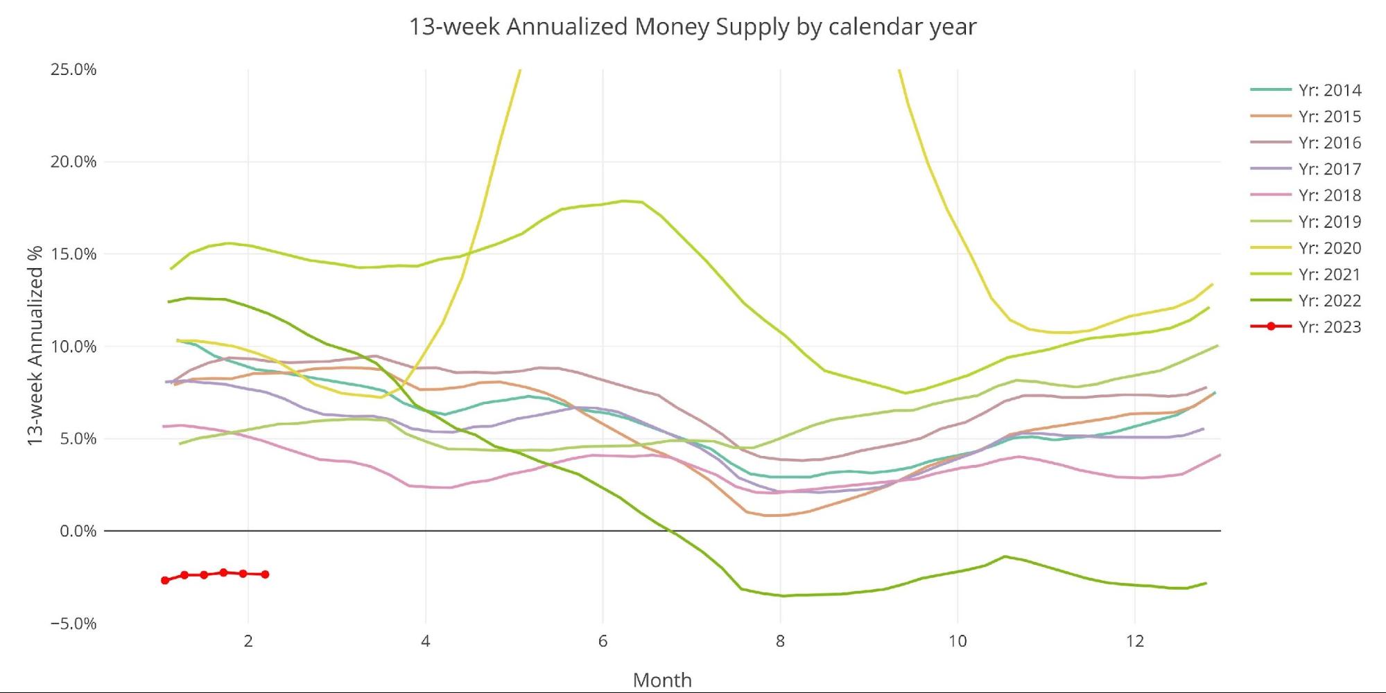
The plot below really helps show the current divergence seen in 13-week M2. This year has started deep in negative territory and well below all past years. 2018 is the next closest year at the same point in time, coming in at 4.5%.
Figure: 7 Yearly 13-week Overlay
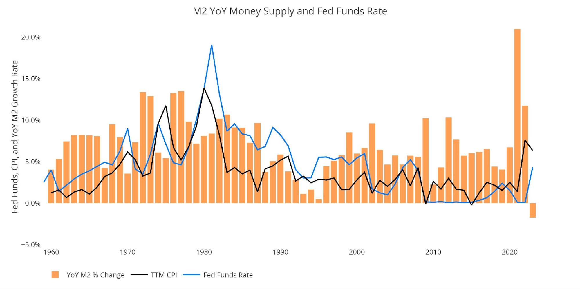
Behind the Inflation Curve
Incredibly, even with the contracting money supply, the Fed is still not doing enough to solve the inflation problem. To combat rising prices, the Fed would need to undo most of the money it has created over the last several years. This would require bringing interest rates above the rate of inflation to really collapse the money supply.
This can be seen in the chart below. The black line and blue line are converging, but they have not inverted yet. The blue line (interest rates) has always risen above the black line (inflation) to combat high inflation in the past. Remember, the CPI has been greatly modified since the 1970s and 80s to understate current inflation. Thus, the magnitude of the current divergence is definitely understated.
The fall in Money Supply over the last year looks very modest when compared to the massive increases seen recently. Think about the amount of pain caused just by this dip. The Fed can ignore the current downturn, but job cuts have been very noticeable and the stock market is certainly struggling to find any traction. To actually undo all the recent inflation the Fed would have to completely torpedo the economy.
Figure: 8 YoY M2 Change with CPI and Fed Funds
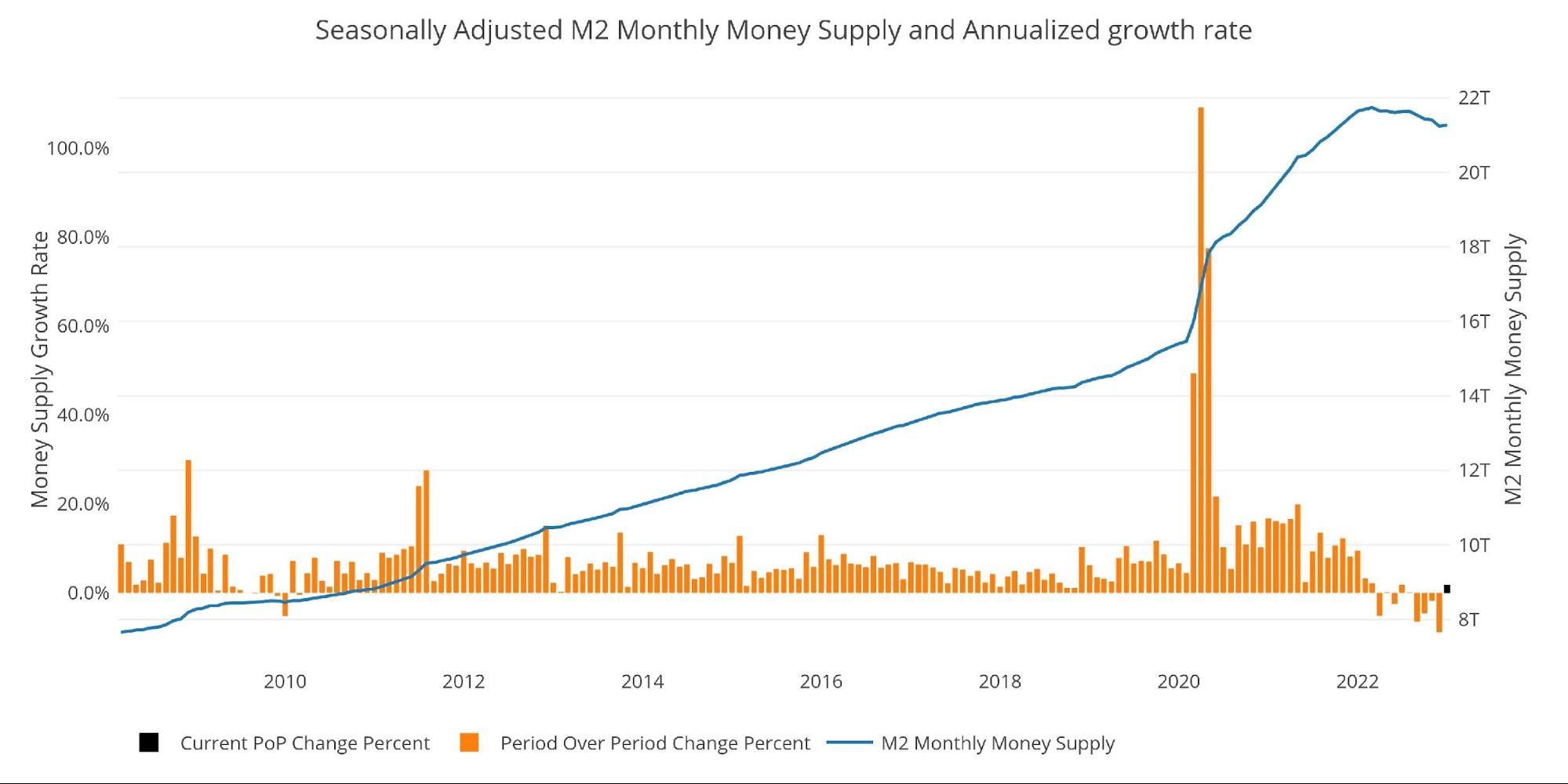
Historical Perspective
The charts below are designed to put the current trends into a historical perspective. The orange bars represent annualized percentage change rather than a raw dollar amount. The current slowdown can be seen clearly on the right side.
The Money Supply slowdown is a major driver of the weakness seen in the stock market over the last year. The massive increase seen in 2020 is what pushed the market to explode higher. Now the stock market is out of fuel which has left it directionless over the last several months.
2023 started strong, but that was on the belief of a Fed pivot. With the pivot becoming less likely, February saw a significant pullback in the market. There is no fuel to keep the bubble economy inflated and the stock market is reflecting this reality.
Figure: 9 M2 with Growth Rate
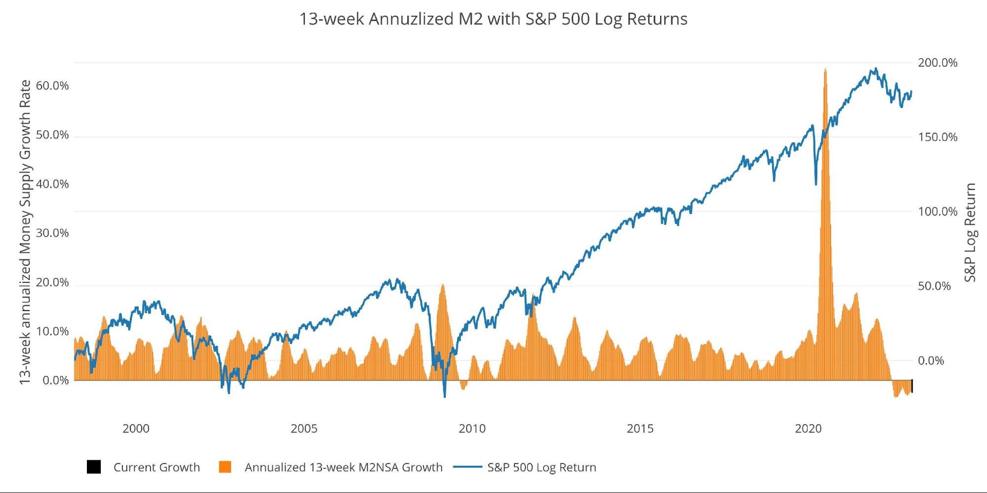
Taking a historical look at the 13-week annualized average also shows the current predicament. This chart overlays the log return of the S&P. Mr. Wenzel proposed that large drops in Money Supply could be a sign of stock market pullbacks. His theory, derived from Murray Rothbard, states that when the market experiences a shrinking growth rate of Money Supply (or even negative) it can create liquidity issues in the stock market, leading to a sell-off.
While not a perfect predictive tool, many of the dips in Money Supply precede market dips. Specifically, the major dips in 2002 and 2008 from +10% down to 0%. The economy is now grappling with a peak growth rate of 63.7% in July 2020 down to more than 6 months of negative growth rates.
Amazingly, the stock market has held up as well as it has, but likely that is because the major events have not yet manifested themselves. The collapse has been so sudden and significant that it hasn’t had time to be fully digested by the market. As time wears on, the rot from 20 years of easy money will begin to manifest.
Please note the chart only shows market data through February 6th to align with available M2 data.
Figure: 10 13-week M2 Annualized and S&P 500
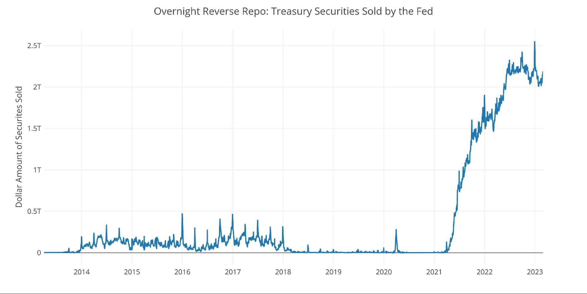
One other consideration is the massive liquidity buildup in the system. The Fed offers Reverse Repurchase Agreements (reverse repos). This is a tool that allows financial institutions to swap cash for instruments on the Fed balance sheet.
Current Reverse Repos peaked at $2.55T on Dec 30. This broke the previous record from September. The value always tops out at quarter end. Since then, it pulled back to $2T and then rebounded back up to $2.13T.
Figure: 11 Fed Reverse Repurchase Agreements
What it means for Gold and Silver
The review of the money supply has been fairly similar over the last several months. Quite frankly, it is a picture of the Fed’s attempts to tighten. They are certainly doing enough to take the legs out from under the market, but nowhere near enough to get inflation back below 2%.
Recent inflation readings have been higher than expected and this may continue for some time. Again, think about all the money that was created. Not enough is being done to undo all that money creation. While inflation remains elevated and the market still believes the Fed will fight it, gold and silver will likely have trouble gaining momentum. However, when the broken things in the economy start to manifest, the Fed will need to come to the rescue. There is no chance inflation will be back below 2% by that point. This is when the Fed will undo any mild progress it has made over the last year and send inflation raging higher.
Prepare yourself in advance, and protect your dollars with physical metal that cannot be printed at will by Central Banks!
Data Source: https://fred.stlouisfed.org/series/M2SL and also series WM2NS and RRPONTSYD. Historical data changes over time so numbers of future articles may not match exactly. M1 is not used because the calculation was recently changed and backdated to March 2020, distorting the graph.
If you knew you were standing inside a stock market bubble, you wouldn’t be standing… Read More
A nationwide credit card outage in Japan disrupted shop payments, rail pass purchases and Mobile… Read More
Defense startup Neros has secured a US Army contract valued at up to $500 million… Read More
Ownership of AI and control of personal data are no longer abstract questions for techies… Read More
Faith institutions already own land and want to help address community needs — can this… Read More
The U.S. economy grew 2.1% in real terms in 2025, but that national figure tells… Read More
This website uses cookies.