Image Courtesy Of The Felder Report
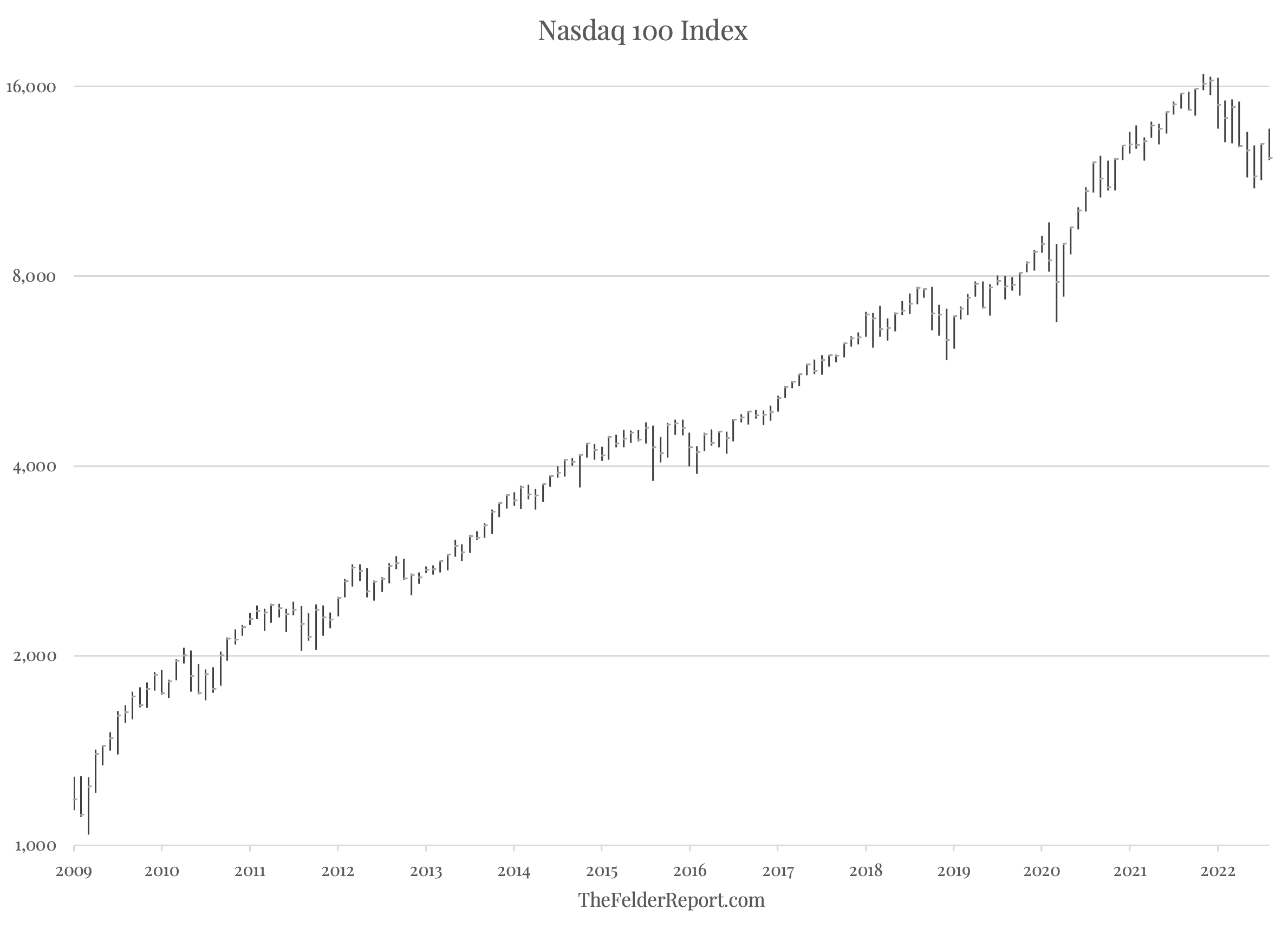
A little over a year ago, I had the pleasure of interviewing Michael Oliver in person at his home in Colorado (listen to that interview here). While he shared a great deal about his unique methods, the main focus of our discussion was the “massive momentum structure” that had been building for years in the stock market, specifically in the Nasdaq 100 Index. Below is an updated version of that chart which plots the index on a monthly timeframe along with another plot of the index relative to its 36-month moving average. It is this second chart, which isolates the price momentum of the index, that has formed a long-term structure of some significance.
This article was originally published by The Felder Report.
During the bull market that dated back to the 2009 low, the Nasdaq 100 Index formed a clear momentum range between roughly 40% (above the 36-month moving average) on the high side and 10% on the low side. The post-Covid rally saw a breakout above the upper end of that range, which represents the final “blow-off phase” of the bull market. This year’s reversal is notable in that not only did momentum fail to hold support at the 10% level for the first time in over a decade, it also failed to hold the 0% level, a “declarative first leg of decline,” in Michael’s words. And even to the untrained eye, it should be quite obvious that a major change in character is now underway.
The U.S. economy grew 2.1% in real terms in 2025, but that national figure tells… Read More
Much of the concern surrounding artificial intelligence is about power: the technology’s economic power to… Read More
Cuba fully restored its energy grid early Wednesday after the third nationwide blackout this year, but… Read More
Up until now, the politicization of AI models generally ran in one direction with US… Read More
Americans are increasingly reaching major life milestones later than previous generations, and parenthood is no… Read More
Sen. Scott Wiener requested the exemptions, and they exactly match his SB 145 legislation. Editors… Read More
This website uses cookies.